For the last few weeks I have been continuously improving my CV and business card, changing the layout to give more white space, with the hexagon background selected for my business card, adjusting text sizes and fonts, and I have actually used a different program altoghether to make my CV than I did in the first place, giving it a more professional outcome all around.
The different versions of each of these can be found in my sketchbook, and each development shows much improvement.
I am so grateful for Mariana's advice, (as reluctant as I was at first to start altering my designs, I do think now that they have improved a lot because of it.
As for the colour scheme, I have recently looked at the psychology for colour, and it seems that the blue that has stayed consistent throughout is a sign of being mental. I don't mean crazy, but using the mind, being a thoughtful and logical person, which indeed defines me, and the way I have always been defined. So this link to the colour blue does in fact have a 'deeper' meaning.
Wednesday 13 April 2011
Sunday 27 March 2011
Progression
Upon being reviewed by Marianna, some suggestions have been made to improve my business card, logo and cv. I have taken the suggestions on board and attempted to redesign them with the new specifications in mind.
Firstly, my logo was changed. I applied the font found after making the logo ( used on business card) which is quite similar to the modified jpg font I created, and experimented with differnt coloured font colours, background colours and triangle colours. (I decided to keep the triangle).
This font was then filled in due to feedback being (it wasn't as strong as the previous version, the initials are quite visually eye-catching).
This was decided as my final logo design and has been included on my business card from now on.
I have also started to develop my paper-based portfolio, which will be taken to interviews to demonstrate my work. This along with my CV and business card will now be developed.
Monday 21 March 2011
Business Card Design
I have chosen my business card design to present to Mariana, it is shown below (front and back);


The digital versions were created using a psd format template from the company I intend to buy my design prints from.
As shown, I selected the hexagon idea. The gradient idea that I have produced couldn't be communicated clearly in a sketch, but upon digitising it I quickly fell in love with how great it actually looks.
Link graphics
I have attempted one of the jobs listed by our leader that need to be completed.
Below is a shot of the image that will link to the list of portfolios to choose from by student.
(It will fit into one of the image spots at the bottom of the page).

_________________________________________
FEEDBACK:
A different font will be needed for continuity on the site; we are already pushing the boundaries of number of fonts used, and perhaps a change of student images?
Friday 18 March 2011
One more contribution to our site
From another module I have been offered the opportunity to learn how to make use of the web service of Google Maps. This would benefit our site by having an interactive map feature on the page instead of just a static image, which users could manipulate to better help them with directions to the exhibition.
This entails using JSP coding.
I have 'cracked' how to get thisfeature working for our site after a good session of digesting horrible code!
I am proud though to say I seem to have it working and that it will be amongst my contributions to the site.
Below are images of the system I made for the service to be tested.


Monday 14 March 2011
What I have been working on recently
I have digitised my sketches of the website layout. The plan was for each of our members to come up with their own designs from which elements could be taken for a hybrid design for the site.
The images below show my designs with some dummy images from our group's dropbox folder to give it more realism.
(Please click on the images for a larger view).
The Home Page:

The page to select a student to view their individual work:

The page for an individual student (the images would be of the same student from different angles holding different poses).

Tuesday 22 February 2011
Images of work
I have been asked to provide three images of the pieces of work I want to demonstrate.
For the radio broadcast, I may just create a logo now just to catch people's attention, as the piece is purely sound based. As for the actual piece itself, it has been suggested to buy a cheap pair of headphones and a cheap mp3 player and fix them to my board somehow. This would be accompanied by an explanation of the piece.
For the advertising campaign, I have a couple of images to choose from (I am as yet undecided whether to have the plain image of my logo and text or the alternative with all the information. Both however are shown below.

For the website re-design I will simply show the index page of the site, as shown below.

For the radio broadcast, I may just create a logo now just to catch people's attention, as the piece is purely sound based. As for the actual piece itself, it has been suggested to buy a cheap pair of headphones and a cheap mp3 player and fix them to my board somehow. This would be accompanied by an explanation of the piece.
For the advertising campaign, I have a couple of images to choose from (I am as yet undecided whether to have the plain image of my logo and text or the alternative with all the information. Both however are shown below.


For the website re-design I will simply show the index page of the site, as shown below.

Monday 21 February 2011
Work Selection
I have selected the three items of work I am most proud of, and want to exhibit. At least, .. sort of.
I have three pieces of work as follows;
- A website re-design of Yvettes Bridal Shop
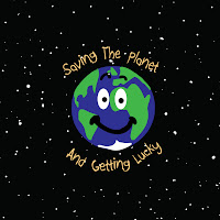
- An advertising campaign for saving the planet
- A radio broadcast
Although, the last piece of work is entirely audio based. It was mentioned that we could exhibit animations, but not a piece based on sound primarily. So, in case this is a problem, I do have a backup. But assuming the projector for the animations play sound (because at least some if not all will need sound support) surely I could play my piece, even with a static image on screen like I could make a fake logo for the radio station.
I have three pieces of work as follows;
- A website re-design of Yvettes Bridal Shop
- An advertising campaign for saving the planet
- A radio broadcast
Although, the last piece of work is entirely audio based. It was mentioned that we could exhibit animations, but not a piece based on sound primarily. So, in case this is a problem, I do have a backup. But assuming the projector for the animations play sound (because at least some if not all will need sound support) surely I could play my piece, even with a static image on screen like I could make a fake logo for the radio station.
Sunday 20 February 2011
Choosing a group
Having decided on the concept of 3D, it was now time to choose what sort of work to pursue for this module.
This week we had to pick a group to work in, out of working on the exhibition itself, working on graphics and working on the website.
The graphics for this module have been created; at least an initial idea and colour scheme. I suppose the team wouldn't have to stick to it but there was a strong interest amongst the group fo the graphics portion of the work. And aphics havent always been my strongest point.
I did think it would be quite interesting to do the exhibition, because it would be new, something different to accomplish, whereas I have designed graphics and websites before.
But in the end I chose to do the website work, even before some people swapped groups after hearing the list of tasks.
With Arnas as our leader and some strong students in our group, I believe this website is going to turn out really strong and well designed.
Tuesday 15 February 2011
Materials for my business card
Recently I have had a trip into the town to do some reseach for some interesting materials for my business card.
There is always the obvious option of card, but upon looking around, in a crafts shop I found a few interesting ideas.
The main basis of my favourite idea was a card made of plastic that had been cut into to look like a stencil. The idea of using a more durable material like plastic I found to be interesting, because to me this would be the sort of business card that is meant to be kept, rather than a piece of card than will just be thrown away.
I found some acetate (clear plastic) which can be put through a printer (for ease, efficiency and a professional look, rather than handwritten).
Following this I found a thicker clear plastic sheet which would be more sturdy than both the acetate mentioned earlier and the initial card.
To run an A4 sheet of this through a printer with a template of many cards to a sheet would not be too much trouble.
To make this more interesting, I would like to experiment with shape. It has been suggested to incorporate origami, but I believe this to be too complicated, and may decrease the professionalism and appear 'tacky' to some employers.
Business Card Design
Now I have started to develop business cards to send out to prospective employers.
Designs are in my sketchbook, and revolve around different layouts, formats and shapes being used.
I have considered what information I wish to share on the cards, and then decided more how to display it.
Designs are in my sketchbook, and revolve around different layouts, formats and shapes being used.
I have considered what information I wish to share on the cards, and then decided more how to display it.
My Website
Granted, it is still in construction and at this point only contains three incomplete pages, (and it is of a very simple and minimalistic design) but I have got a website set up and online. It can be found at:
www.philgibbins.com

If I got this up and running in the near future, I could limit the information on my business card to being just the logo and the website for a clean and minimalist design.
The idea is that the website will be an online portfolio. It has not necessarily got the best graphic design, but the idea was to keep to a clean, professional minimalist colour palette and get the information across, like the apple.com website.
More images will brighten up the portfolio pages, but when the content has been uploaded various screenshots can brighten up the Home Page for example.
My Personal Logo
Before this module even started, I was in the process of making my own 'branding' to represent myself. This consists of a logo, a business card and a website.
First of all I have created this logo.

It keeps to a minimal colour-palette, sticks to the simple design feature (as recommended by my lecturer) of typos or in this case my initials, and incorporates a simple shape to add a bit of an interesting feature to it without taking away focus from the lettering.
Having now actually got to the stage where I am trying to make a business card for real, I think this may need to be re-done as a vector image rather than a high-resolution jpeg image.
Presentation
For our presentation we have come up with a few images to show rather than a powerpoint presentation.
Featured is a floorplan, a t-shirt design, various graphics and just a few ideas towards the concept as a whole. The idea is to focus on the work itself rather than have a dominant theme that overshadows the whole exhibition.
To contribute to this, i did some research on the idea of having a sculpture. The pixel art idea was favoured amongst the group, and so not to overcomplicate the sculpture we could have a simple shape or object.
The idea of a pair of 3d glasses wasthought up by another group member, and I have done a sketch to back this up.
The only problem with this is the piece being quite low and wide, it may be hard to notice and take up a lot of floorspace.
Wednesday 9 February 2011
Exhibition Visits (Part 2)
Other interesting ideas I found at these places were the incorporation of special features like wax figurines, and reaching out to other senses rather than just sight. Audio and touch was used at the Castle so you could feel certain objects whilst hearing about them, (and some history) and move others saying "pull me", giving more interactivity.


The sense of smell was used at the Natural History Museum...? Impossible...

The third location was a FirstSite exhibition of students work fromthe University of Essex. It featured a few pieces (shown below) in a contemporary setting (like a small version of the TATE modern) which had been built into a small shop in a back-street full of shops, right in the shopping centre.


Other features of the exhibitions that were taken into account were lighting and placement. The Castle had some nice pieces of artillery and weaponry with a strong white background and generous lighting, the Natural History museum had an AMAZING glass cabinet which was well lit and double-sided, and the little FirstSite shop had shelves hung from the ceiling.


Finally on the way home we took a detour to Mersea Island (I was mis-informed that the destination was in Colchester), home to the Island Art Cafe. This lovely little cafe was home to both a homey cafe serving all types of food, and a small art exhibition, which I thought was an interesting mix. Great lighting accented the pieces, and people had the option to have some food and refreshments whilst observing the work of local artists, which they could then purchase.


Exhibition Visits (Part 1)
Today I had a little trip up to Colchester (with a little detour on the way home) to view some exhibitions.
It didn't go quite to plan, but I did visit three of the four places listed in my last post, and an extra one instead.
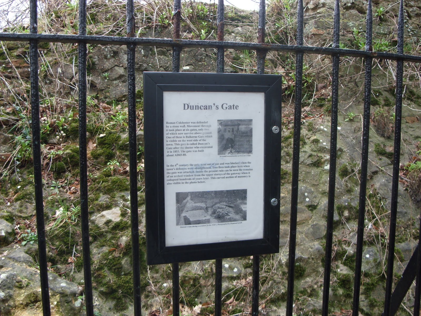
Sticking with the idea of steering clear of the regular art exhibitions, I started off with a visit to the Colchester Castle Museum, followed by the Natural History Museum. Colchester Castle was home to a great number of historical artefacts based on the Roman Invasion.


The castle park itself (the grounds as well as just the castle building) we found had a sense of exhibition to it also, with maps of the grounds pointing to extra little pieces like this gate with some information:


The Natural History museum had fantastic displays and models of wildlife, whether it be models of rare breeds of bird, to a cat sitting in a window of a house, to a fossil of a whale or a crocodile's skull.


In the Castle, I found the arrangement to be very directional at first, although the guidance was sort of lost when you headed upstairs because there were multiple ways to go.


However the Natural History Museum was very open and you could choose where you wanted to go and what you wanted to look at at anytime.

This was a great contrast between layouts and both give interesting ideas as inspiration for a floorplan.
It didn't go quite to plan, but I did visit three of the four places listed in my last post, and an extra one instead.
Sticking with the idea of steering clear of the regular art exhibitions, I started off with a visit to the Colchester Castle Museum, followed by the Natural History Museum. Colchester Castle was home to a great number of historical artefacts based on the Roman Invasion.


The castle park itself (the grounds as well as just the castle building) we found had a sense of exhibition to it also, with maps of the grounds pointing to extra little pieces like this gate with some information:


The Natural History museum had fantastic displays and models of wildlife, whether it be models of rare breeds of bird, to a cat sitting in a window of a house, to a fossil of a whale or a crocodile's skull.


In the Castle, I found the arrangement to be very directional at first, although the guidance was sort of lost when you headed upstairs because there were multiple ways to go.


However the Natural History Museum was very open and you could choose where you wanted to go and what you wanted to look at at anytime.

This was a great contrast between layouts and both give interesting ideas as inspiration for a floorplan.
Tuesday 8 February 2011
Places selected to visit
Looking at Colchester, it seems there are some great places to visit that are all relatively near to each other. They consist of:
The Natural History Museum - CO1 1DN
Colchester Castle Museum - CO1 1YG
The Minories - CO1 1UE - Featuring a DENNIS WITH MILLER exhibition
The Island Art Cafe - CO1 1JN
I plan to visit these tomorrow. They are all relatively near to each other and provide a great range of style from historic artefacts to paintings.
Exhibitions
To 'research' different exhibition styles, layouts and features I have decided to go to some exhibition spaces.
Firstly, I decided I want to venture away from 'normal'. When I hear the word 'exhibition' I think London, TATE, etc. Yeah, sure I could go to all the glamourous up-scale places in London, but I don't want to do that for two reasons;
- EVERYONE is going to do this. At least most people. After todays lesson I have found that people have already started venturing out into London, and there is more art and exhibitions in the world than just the capital. I WANT TO DO SOMETHING DIFFERENT.
- I've been there before, it's all the same. I know, the exhibitions change. But the place stays the same. But most are just rooms with paintings on the wall. What about different places, like an airfield museum? Where there are physical objects to be arranged. I know the TATE modern would have to deal with this, but other people will have/are going there. Like I said, I want to diverge from the popular choice.
Doing some research on the Internet, mainly based on visitessex.com (and touching on www.essextouristguide.com also) I found that Colchester is a great place to visit.
Places I intend to visit perhaps to gain more of a comprehensive view to the word exhibition than just an arrangement of paintings, on wall(s), in room(s).
Concept For Our Presentation
After attending the lesson today, our group has decided that we all like Matt's idea of the History of Computer Gaming.
Having drawn up an initial sketch of the floorplan and shown it to us, we have determined that there will be projectors showing different stages throughout gaming history, one of 'Pong', one of 'Sonic the Hedgehog' and then more recent, third generation characters.
Other suggestions that came out were different logos on each person's board for consistencey, the grass that features in 'Sonic' games running along all the boards for consistency.
Also, having seen the Messanine area, a greater understanding could be created of the exhibition space and what is available to us. Great lighting which was mostly natural would be good for an exhibition, except ours will have projector(s) screening animations. It was suggested that the boards could be arranged to block out as much of this light as possible (quite a shame really).
We all like this idea though, now we just need to progress it to make it presentable for next week.
Monday 7 February 2011
Thinking as a whole
When you see big events on television that look professional, whether it be an art exibition in the TATE or a gorgeous wedding reception or 60 minute makeover, there is always a colour scheme behind it all.
Focusing on the wedding reception idea specifically, there is a consistent colour scheme throughout the whole event. This could be the concept of our class; to have a consistent and professional colour scheme that everyone sticks to.
The colour of course would have to be decided, but there is still the great freedom of shade variety, you could have a constant change between people's work e.g. the boards neatly in lines going from near-white to near-black. Like pale blue to deep blue.
Advancement Of Ideas
Having spoken to Mariana (the lecturer) about the concepts that I have thought of, it was agreed that the concept of colour although interesting, is much too broad.
Now having a better understanding of the module and that the concept will be for the whole class and not our group, I can fine-tune the idea so that it is suitable.
So what could I do with this idea of colour?
One idea I have had (which sort of brings my two ideas together in a way) is focusing on the lack of colour like I have mentioned previously. With only black and white (picturing a tuxedo) this could be portrayed as professional. Higher class clothes meet higher class work...
Another venture from this could be to focus on shades. With reference to the PANTONE colour libraries, a colour scheme is picked by designers using different shades of the same colour.

Again, this could be classed as professional as most (good-looking) websites are based on a colour scheme of one or two colours in multiple shades.
Friday 28 January 2011
Examples Of Work to be included on board
Of course I have my favourites, but I cannot fully decide which pieces of work to include until we have decided on a group concept.
Therefore at this point I will keep to myself which pieces of work I think I will choose and just list all the candidates here. This will also provide the opportunity to have a comprehensive list incase I have overlooked any pieces that may have been forgotten.
Year 1
- Semester 1
- - Multimedia Tools & Technologies
- - - - 2D Animation of Reclining Chair *
- - Creative Methodology
- - - - V- Fest Chair
- - - - Static Advertisements (AA, Moss Bros)
- - - - Advertising Campaign (HTSTWAGL) *
- - Design For The Internet
- - - - Gaming Website
- - Communicating With Images
- - - - Poster
- Semester 2
- - Introduction To Sound
- - - - Radio Broadcast *
- - Introduction To Video
- - - - Ghost Photographer Video
Year 2
- Semester 3
- - 3D Modelling & Animation
- - - - Stamps
- - - - Fable Animation
- - Group Design Project
- - - - Groove BMX Website
- - Interaction & Usability
- - - - Hotmail Interface
- - Data Handling
- - - - Website with mySQL
- Semester 4
- - 2D Animation
- - - - Locust Animation *
- - Web Design
- - - - Yvettes Website Re-design *
Year 3
- Semester 5
- - Advanced Sound Techniques
- - - - Soundscape *
- - Virtual Environments
- - - - Head Model *
- - - - Pier & Plane Models *
- Semester 6
- - - - These are in development now so will not be included - - - -
From this list I will choose the three pieces of work I am most proud of and which best represent what I can achieve. Favourites are marked with *.
Initial Idea Development
Rather than have an image of myself (which could be majorly embarassing, misunderstood, or too dominant in terms of consistancy within my group), I thought of having an outline of my body in this same pose, or better yet, this shape embodying text. Below is an example of this (a poster which actually inspired the idea partially) although I have done a sketch which better represents this at the end of this post.

Source: http://www.simongreiff.com/theatre_saturday_night_fever.htm
This text would put across the strong message I tried to explain in my last post; that I personally am proud of the work I have produced at university, but it does not properly show the world what I can achieve. As shown below this would be encased by the three pieces of work I am most proud of since being at university.
Inital Sketch .............................& With Worded Effect


(Click to enlarge)
Subscribe to:
Posts (Atom)